Case study · Redesign
Scheidt: Redesign with Elementor Pro.
Clear navigation and a straightforward presentation of supply stations and transformer stations – for a company with high technical standards.
Built with Elementor Pro
From us, as an official Elementor Agency Partner.
Live on scheidt.de
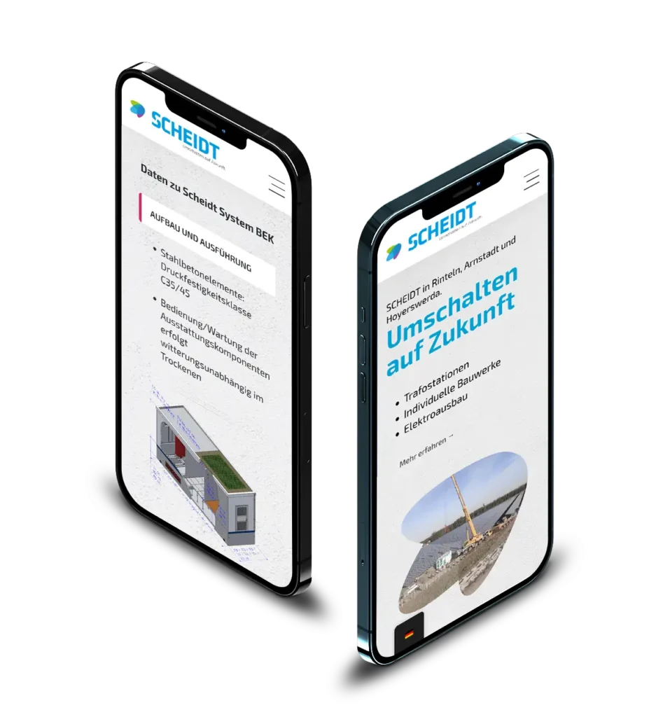

Power Station Construction & Energy Technology
Customer
Scheidt
Industry
Power Station Construction · Energy Technology
Project
Website redesign
Technology
WordPress · Elementor Pro
Focus
Navigation · UX
01 / The project
Complex technology, explained clearly.
When redesigning scheidt.de, our focus was on creating clearly structured, user-friendly navigation.
Equally important was the clear and intuitive presentation of the supply stations and transformer stations. The aim was to present complex technical information in an accessible way and to enable visitors to find their way around quickly.
Through a optimised information architecture, modern UI/UX standards and a responsive design have resulted in a website that is both functional and visually appealing – and reflects Scheidt digital’s high standards of quality.
This WordPress website we have used the Page Builder from Elementor implemented.
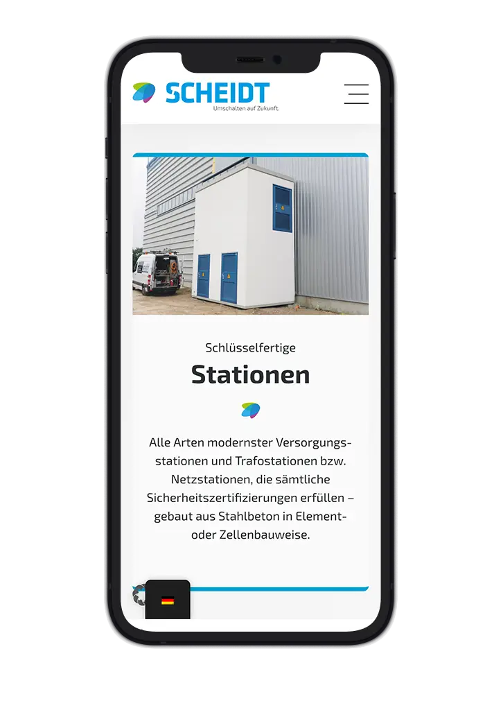
Stations
Technology clearly organised
The task
To present complex technical content in an accessible way and enable visitors to find their way around quickly.
Scheidt
Website redesign
02 / Key areas of implementation
Six key areas the implementation.
01
User-friendly navigation
A clear page structure with a logically organised menu makes important content accessible in just a few clicks.
02
Refreshment stations
A well-structured presentation with a logical layout, a clear hierarchy of information and user-centred presentation of technical content.
03
Transformer stations
A consistent design concept with a focus on readability, comparability and visual clarity.
04
Improved user guidance
Clear calls to action, consistent design elements and a minimalist, functional design language.
05
Responsive web design
Optimised display and usability on all end devices - from desktop to smartphone.
06
Modern UI design
A clean, uncluttered design that conveys professionalism, technical expertise and brand identity.
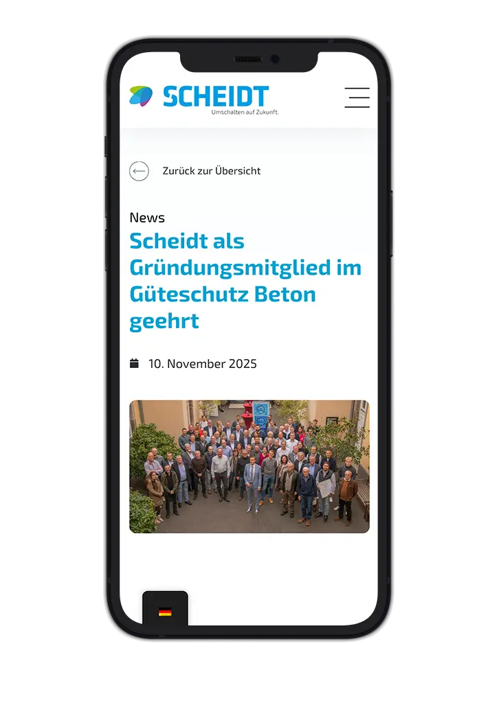
News
The latest news at a glance
03 / Result
Strong in technical terms, visually clear.
The website is now a high-performance, user-friendly and future-proof platform.
It is impressive both in terms of content and visuals, and professionally showcases Scheidt’s expertise and innovative strength in a digital format.
OrientationEssential information in just a few clicks
UnderstandableStations clearly shown
ResponsiveFrom desktop to smartphone
The next step is a meeting.
Your new look. Let’s get started.
Do you already have a specific idea? Or do you simply feel that your website could do more? Tell us about it.
No obligation · personalised · direct

Tobias Ebert
Managing Director · laOlaWeb